Image and Layout Issues - Suggestions for Creating Great Templates for Customers
When you are ready to begin uploading new templates into the system, we encourage you to consider the size of your imagery and the amount of text space that is available to potential customers.
While your primary focus as an illustrator, graphic designer, artist, or photographer is on the image, that is not necessarily the case for the customer. The customer's ultimate priority is to be able to display all of his/her information on the card. The image is supportive to their business and secondary. If they cannot clearly communicate their information on the card, the image is useless to them. So, with that being said, we want to offer up some great examples of templates that accomplish this task well.
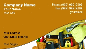
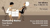
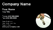
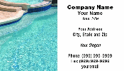
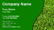
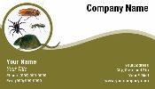
The three templates shown above sell frequently. They not only have great imagery on them for their specific professions (towing, handyman, nail salon) but they also have ample, easy to negotiate, text space for the customers.
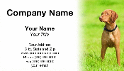
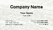
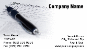
There are many ways to attractively place your image on the template and still allow plenty of room for text. Image isolation, placing the image to the left, right, top, or bottom, or fading the image out to offer text space are all great ways to accomplish this too.
Basically, we just wanted to offer up different ideas to you on how to create a business card template that is going to be attractive to customers and will sell. Please feel free to email us with questions or ask them in the forum (doing this will hopefully help other artists as well since they can read about it too).
Thanks!


